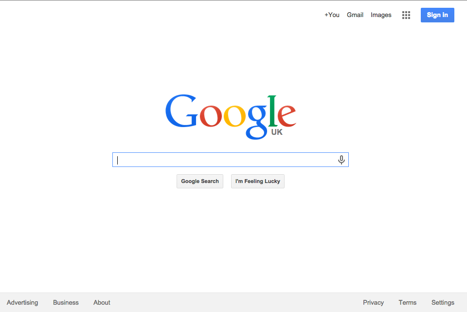
The Odin Project - Google Homepage Build
Following the HTML/CSS Basics course on The Odin Project, students are asked to undertake a project to rebuild the Google homepage.
What's this project about?
The project is ostensibly about testing your newly learned skills with HTML and CSS but it also calls on you to use Git, GitHub and the Developer Tools in your browser. These are all fairly simple tasks but with anything you do for the first time, getting it done can be a little daunting.

Thankfully for me, I have been using Git and Github for a couple months and have had a lot of experience reading through and hacking at pre-existing HTML/CSS, so for me this was a fun (ish) project to see how quickly I could get it done.
Unfortunately, Google minifies and obfuscates it's source code so you pretty much end of just designing the replica page yourself. That's likely a factor in choosing this page in the first place!
How long will it take?
It took me a couple of hours whilst also looking after my 10 month old. But I've done quite a bit of this before and I got a bit picky about it, trying to make it responsive and a decent clone - so that might average out as similar to a new student.
What was the best bit?
Actually, for me, there were two. The first is the moment you look at the final page and it all works. That moment is really the moment that adds the icing on the cake!

The second part I found really useful was submitting the project on GitHub. This calls for you to fork the actual course curriculum, edit it to insert links to your solution and then submit a pull request.
I hadn't done this before as I'd only used Git to control my own projects or to clone some wiki pages. It's not really a headline part of this seciton of the course but I think it's probably as useful as building the project itself.
The Odin Project - Google Homepage: My Solution
You can view my solution to this project using the links below:
Preview the final page in your browser
The trickiest part of the page build for me was working out the 'Apps' icon Google uses. This is the little grid of 9 dots on the top bar. I ended up taking some inspiration from one of the other projects that build it with Divs and CSS and made my own version.
In case you can't view the page for some reason, here's a screenshot of my final build. Compare it to the actually Google homepage above!

Next time I'd sort out the distance between the content and the top, I've used to much space there.
Good luck with your project.